


axf:field-button-icon-down
(Auszug aus "XSL-FO ― Die Referenz" von Manuel Montero Pineda & Steffen Herkert, 2016, dpunkt.verlag)
A | B | C | D | E | F | G | H | I | J | K | L | M | N | O | P | Q | R | S | T | U | V | W | X | Y | Z
Category Acroform in PDF Output
Specifies the icon displayed when pressing the push button. [no-LT]
| Value: | <uri-specification> |
| Initial: | empty string |
| Applies to: | axf:form-field |
| Inherited: | no |
| Percentages: | N/A |
XSL-FO sample:
| <fo:root xml:lang="en" xmlns:fo="http://www.w3.org/1999/XSL/Format" xmlns:cpfo="http://www.compart.net/xmlns/cpfo" xmlns:svg="http://www.w3.org/2000/svg" xmlns:axf="http://www.antennahouse.com/names/XSL/Extensions"> | |
| ||
| ||
| ||
| ||
| ||
| ||
| ||
| ||
| ||
| ||
| ||
| ||
| Antenna House, Inc. | |
| ||
| </fo:block> | |
| ||
| ||
| ||
| ||
| Form field | |
| </fo:block> | |
| </fo:block> | |
| ||
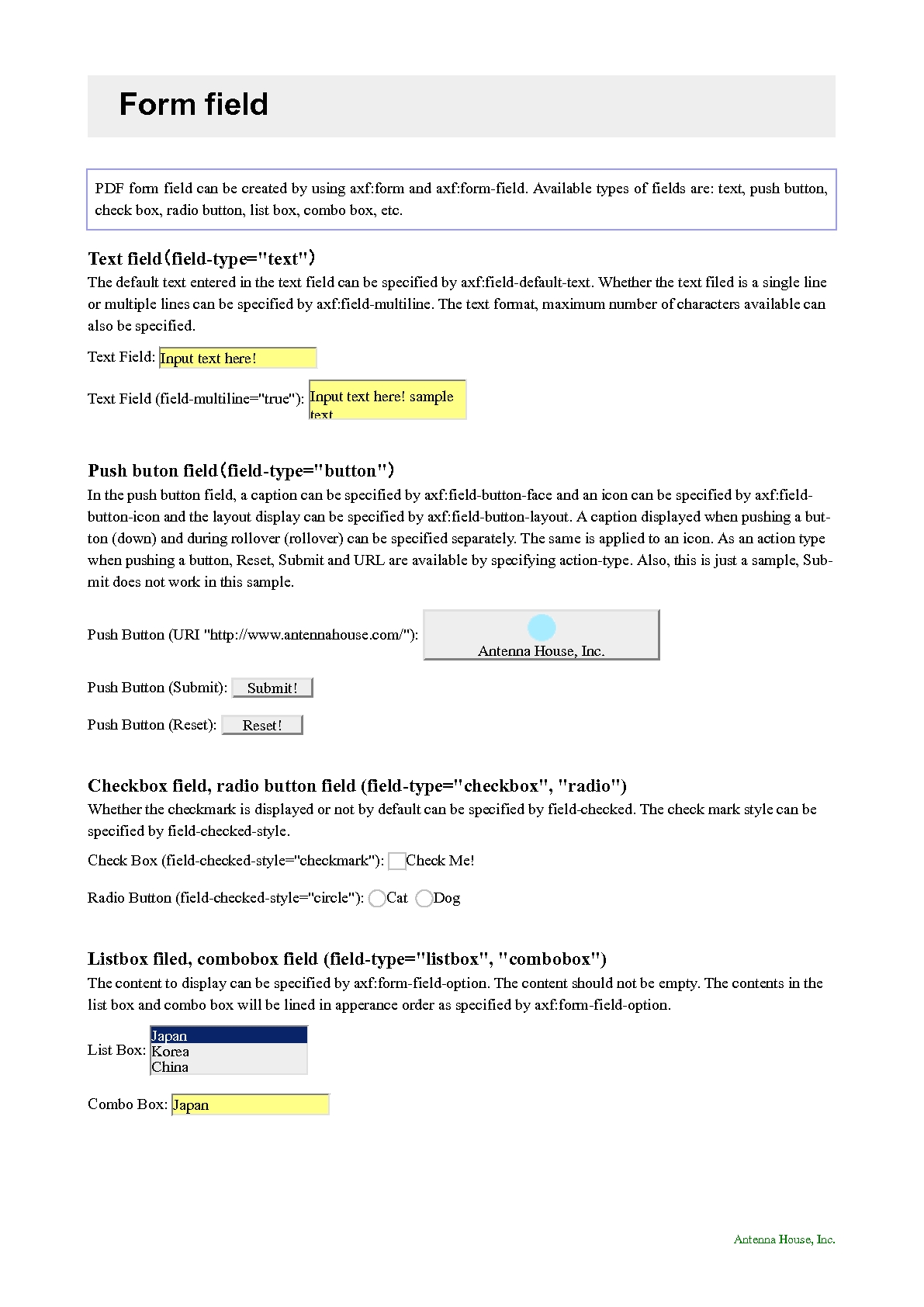
| PDF form field can be created by using axf:form and axf:form-field. Available types of fields are: text, push button, check box, radio button, list box, combo box, etc. | |
| </fo:block> | |
| ||
| ||
| Text field(field-type="text") | |
| </fo:block> | |
| <fo:block> | |
| The default text entered in the text field can be specified by axf:field-default-text. Whether the text filed is a single line or multiple lines can be specified by axf:field-multiline. The text format, maximum number of characters available can also be specified. | |
| </fo:block> | |
| ||
| Text Field: | |
| ||
| </fo:block> | |
| ||
| Text Field (field-multiline="true"): | |
| ||
| </fo:block> | |
| ||
| Push buton field(field-type="button") | |
| </fo:block> | |
| <fo:block> | |
| In the push button field, a caption can be specified by axf:field-button-face and an icon can be specified by axf:field-button-icon and the layout display can be specified by axf:field-button-layout. A caption displayed when pushing a button (down) and during rollover (rollover) can be specified separately. The same is applied to an icon. As an action type when pushing a button, Reset, Submit and URL are available by specifying action-type. Also, this is just a sample, Submit does not work in this sample. | |
| </fo:block> | |
| ||
| Push Button (URI "http://www.antennahouse.com/"): | |
| <axf:form-field field-type="button" field-name="URI Button" action-type="uri" external-destination="url('http://www.antennahouse.com/')" field-button-layout="caption-below-icon" field-button-face="Antenna House, Inc." field-button-face-down="Down" field-button-face-rollover="Rollover" field-button-icon="url(img/icon1.png)" field-button-icon-down="url(img/icon2.png)" field-button-icon-rollover="url(img/icon3.png)" width="15em" height="3em" background-color="#eee" border="2px silver outset"/> | |
| </fo:block> | |
| ||
| Push Button (Submit): | |
| ||
| </fo:block> | |
| ||
| Push Button (Reset): | |
| ||
| </fo:block> | |
| ||
| Checkbox field, radio button field (field-type="checkbox", "radio") | |
| </fo:block> | |
| <fo:block> | |
| Whether the checkmark is displayed or not by default can be specified by field-checked. The check mark style can be specified by field-checked-style. | |
| </fo:block> | |
| ||
| Check Box (field-checked-style="checkmark"): | |
| ||
| Check Me! | |
| </fo:block> | |
| ||
| Radio Button (field-checked-style="circle"): | |
| ||
| Cat | |
| ||
| Dog | |
| </fo:block> | |
| ||
| Listbox filed, combobox field (field-type="listbox", "combobox") | |
| </fo:block> | |
| <fo:block> | |
| The content to display can be specified by axf:form-field-option. The content should not be empty. The contents in the list box and combo box will be lined in apperance order as specified by axf:form-field-option. | |
| </fo:block> | |
| ||
| List Box: | |
| ||
| ||
| Japan | |
| ||
| ||
| Korea | |
| ||
| ||
| China | |
| ||
| ||
| Thailand | |
| ||
| ||
| </fo:block> | |
| ||
| Combo Box: | |
| ||
| ||
| Japan | |
| ||
| ||
| Korea | |
| ||
| ||
| China | |
| ||
| ||
| Thailand | |
| ||
| ||
| </fo:block> | |
| </axf:form> | |
| </fo:flow> | |
| ||
| </fo:root> |
Output:
| Tipp der data2type-Redaktion: Zum Thema XSL-FO bieten wir auch folgende Schulungen zur Vertiefung und professionellen Fortbildung an: |